Media Trainings
How to recognise data-driven lies?
By Nika Aleksejeva, Datu skola
“There are lies, more lies and statistics,” an unknown author once said. An argument seems much more convincing if it mentions a number, doesn't it? There are many ways one can manipulate numbers to create misleading data-driven arguments and it's not just because someone wants to trick you. Data is always limited and incomplete in some ways. The temptation to generalise or cherry pick data to prove one's argument is strong, but journalists must resist it. At the same time, it does not mean we should stop using data to better understand the world. By knowing the limits of data-driven facts and understanding how others can lie with data, journalists can become even more skilful navigators of the oversaturated information environment. This article presents just some, the most popular, pitfalls while working with data-driven facts.
There are three stages in the data pipeline where manipulation is more likely to occur – data gathering, data analysis and data visualisation.
Data Gathering
Data always represents a sample of the total population. The sample may project bias based on location, technology that was used to gather data and the way a question was asked, just to mention a few aspects. For instance, if you land in Frankfurt airport and start surveying people about what Christmas presents they are buying for their loved ones, you will get answers from relatively wealthy people who come from various countries and do not represent German society. Similarly, if you survey people in North Korea on social media about their political views, people who do not have internet access will be left out of your scope and the answers will be biassed, as people would fear consequences for voicing a “wrong opinion.”
Be also aware of your sample size. If a sample contains just a few values, it is more likely to show extreme and unexpected results. Try to flip a coin. How likely is it that you will get heads? You would answer – 50/50, probably. The same goes with most of the random events. Nevertheless, if you flip a coin just five times, you may get all heads, all tails, 4 heads and 1 tail; 4 tails and 1 head, 3 heads and 2 tails or 3 tails and 2 heads. All these results are quite useless. Below you can see – the more you toss the coin, the closer the split is to 50/50 chance.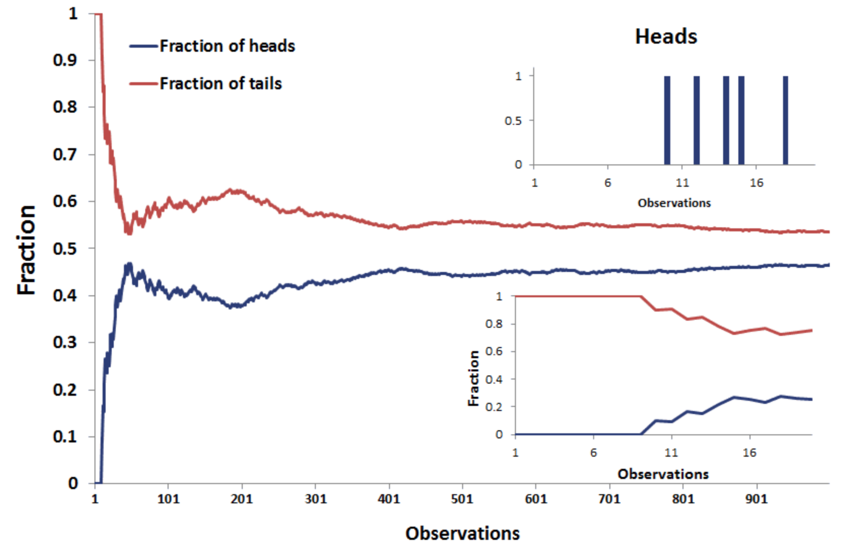
Source: Breaking Down Finance
Data Analysis
“If you torture data long enough, it will confess to anything,” said Ronald H. Coase, a British Economist. This is very true. First, one can cherry pick data. If the whole data-driven “picture” does not look well, use the part that you like the most. Robert Rector, the author of the article titled “Statistics can be manipulated to prove anything,” gives a great example from the pre-election debate between Barack Obama and Mitt Romney in 2021.
“In 2012, when Barack Obama and Mitt Romney squared off, the president was heard to declare that “Over the last 30 months, we’ve seen 5 million jobs in the private sector created.” But 30 months only dates back to January 2010. And the president took office in January 2009.
It turns out that in his first year in office, the country lost some 5 million jobs. While things got better, the cumulative job creation in the private sector during Obama’s first term is in fact a more humble 125,000.
Romney, for his part, said that “If I’m president I will create — help create 12 million new jobs in this country with rising incomes.” While that may have seemed impressive, it’s the exact same figure that had been used by economic forecasters for how many jobs they already expected the economy would add over the next four years given a stable economy. And it had nothing to do with who was in the White House.”
Another cognitive bias we all have is the wish to see connections where there are none. Did you know that the number of people who drowned by falling into a pool correlates (has similar trend in graph) with the number of films Nicolas Cage appeared in?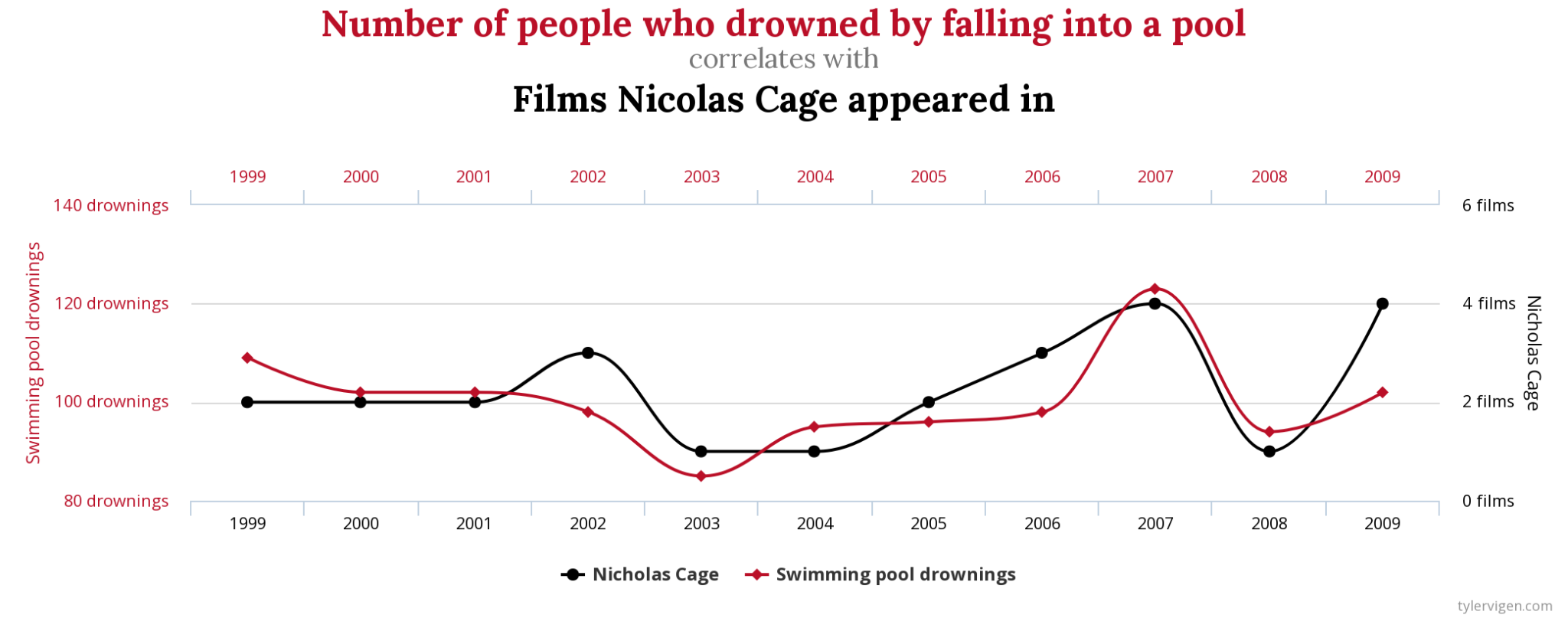 Source: Spurious Correlations
Though data happens to show “something”, we all know that both variables are totally unrelated. Correlation is not causation, is the mantra you often hear from data literacy enthusiasts, and not without a reason.
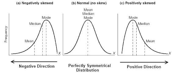
Another, more complex, issue with interpreting data is its distribution in a data set. We often use mean (the sum of values divided by number of values summed up) to express an average value and set a benchmark for what is “common” in a dataset, like average wage, average age. There are other statistical measures to assess “normality” in a dataset – median (the value in the middle of a sorted dataset) and mode (the most common value in the set). If someone says that the average salary in a country is 1,000 euros, it does not mean that this is how much everyone is likely to get.
Source: lms.su.edu.pk
You have a higher chance to get less if the mean is skewed by some very very large salaries, or you have a chance to get more if there are a couple very small salaries. The latter is what happens with life expectancy. If a newborn died, he was 0 years old. It drags the average age of death down for the whole population. The more newborns die, the lower is the average age, though it is likely that adults in that country reach quite an advanced age.
Finally, pay attention to whether numbers are “normalised” relatively to a population they represent. In 2018 Radio Free Europe/Radio Liberty (RFE/RL) published the number of fatal road accidents in Europe in comparison with Russia. France ranked first among European countries by absolute numbers. Later, RFE/RL released a “normalised” chart that showed France in 14th place among European countries with 5.1 deaths per 100,000 people.
Data Visualisation
When it comes to data visualisation, manipulation oftentimes hides in scales and object scaling. First, scales. Check if Y axis starts with 0 and if it makes sense for a chart to have two scales for Y axis. Two examples.
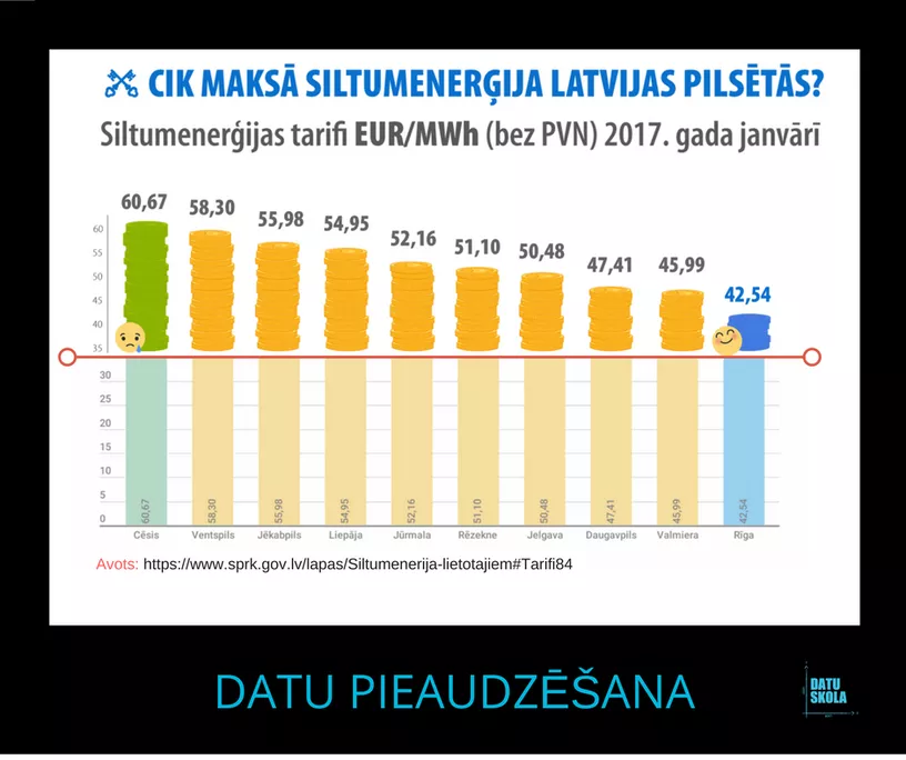
In 2017 Riga city municipality released a comparison of heating prices per MWh across the largest cities in Latvia. Visually it looked as if Riga provided heat two times cheaper than Valmiera or Daugavpils, while in fact it was 10% cheaper than in Daugavpils and 7.5% cheaper than in Valmiera. That effect was due to the Y axis that started from 35 and not 0.
 Source: Datu skola
There are a few cases when it makes sense to “zoom in” data by not starting the Y axis with 0. For example, you are trading stocks and you wish to make a profit even from 0.001% change in stock value. Then it makes sense to start the Y axis from a larger value, so you see small fluctuations in data “sharper”.
Another example is with double scales. Jason Chaffetz, a Republican in Utah, in a 2015 congressional hearing shared a chart which falsely implied that Planned Parenthood performed more abortions than cancer screenings. The effect was due to two inappropriate scales. Alberto Cairo, the professor of visual journalism at the University of Miami, redrew the chart right using one proper scale.
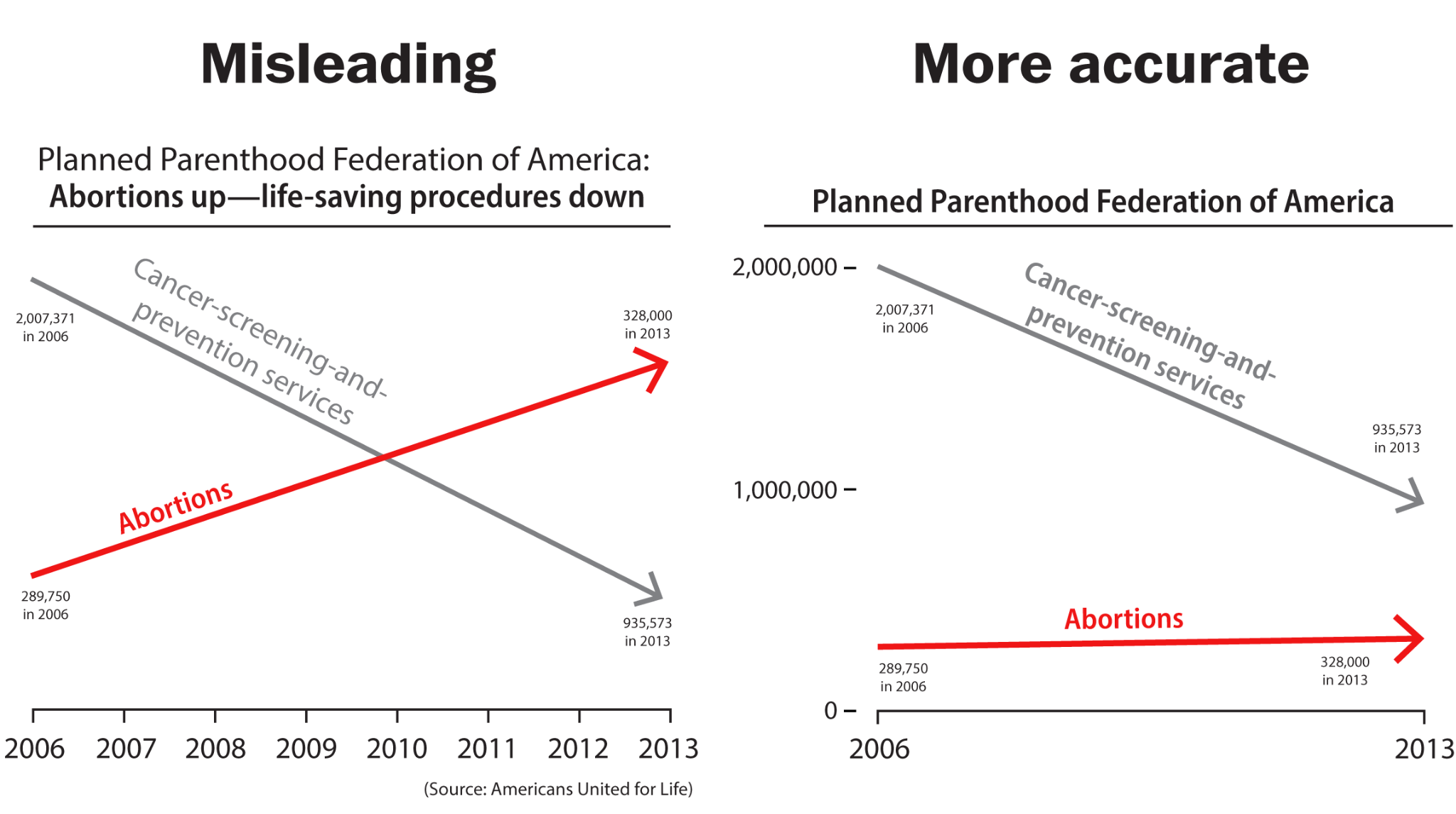 Source: The Washington Post
As for scaling of objects, the right way would be to scale pictorials by their area, but sometimes, especially in manual graphic design, a designer chooses to scale objects by their height, width or radius. If a designer scales an object just by one dimension, it will scale by the other too. Below is an example with frogs. The largest frog is supposed to be three times bigger than the smallest one, while in fact, visually you could fit at least five little frogs in the largest frog. That's because the frogs are scaled by height, but their width also increases and inflates the frog too much.
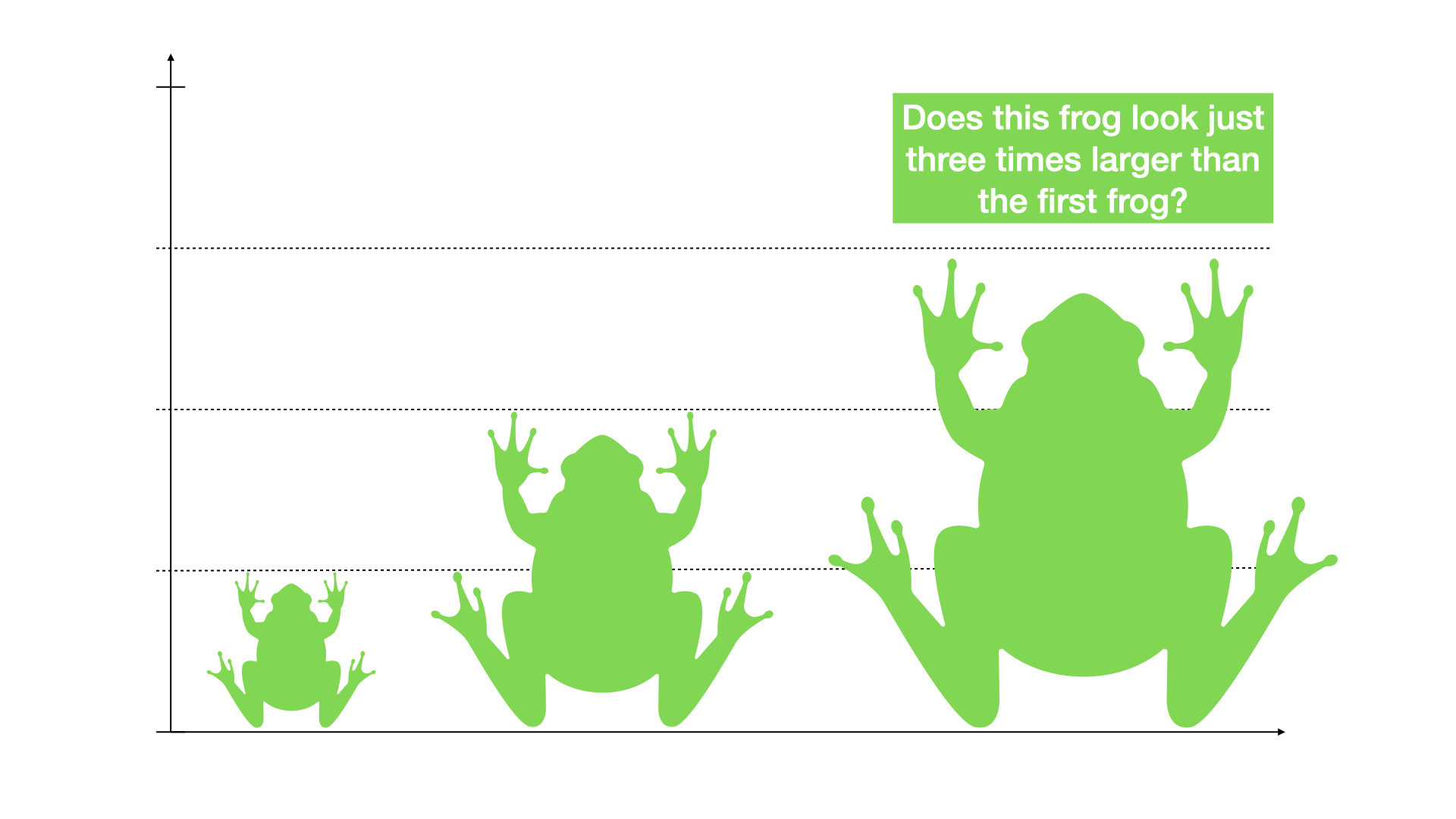 Source: Nika Aleksejeva
Epilogue
As you see, data may lie and not just because someone wants to trick you. Oftentimes a data-driven fact is as good as data-literate is the person who gathers, analyses or visualises data. This article is not an exhaustive list of tricks or mistakes that make data lie. Neither does this article attempt to discourage you from trusting data-driven facts altogether. By knowing how data may mislead, you will hopefully avoid amplifying wrong statements by politicians, recognise if your sources are informed by biassed data and do more data-literate reporting yourself.
---
Video in Russian - https://youtu.be/RpN0HIRhK6I
Video in Estonian - https://youtu.be/5Xd-2bE2ETc
Video in Latvian - https://youtu.be/cmyPS0bs52E
Video in Lithuanian - https://youtu.be/H671awhsliM
Project is supported by the Fund for Bilateral Relations of the EEA and Norwegian Financial Mechanisms 2014-2021.


Media Trainings
How to prepare for a crisis? And how to communicate about it?
How to prepare for a crisis? And how to communicate about it?

Media Trainings
Digital security principles: how to protect yourself and what to do in a crisis?
Digital security principles: how to protect yourself and what to do in a crisis?

Media Trainings
AI Workshops for Baltic Media Professionals
AI Workshops for Baltic Media Professionals